
Did you know there is a way to evaluate exact positions in Google Ads? It’s not easy and not applicable to our daily business, but it makes for an interesting big picture analysis – if you have enough data.
To be honest, I’ve sat on this for a quite some time. The analysis I’m about to present probably has been possible since the early days of AdWords. Now that average position is being sunsetted by Google, it’s kind of the last chance.
In this post, I will outline the general idea (it’s basically just one weird little trick) and present the first findings. In the coming weeks, I plan to publish additional insights.
Collecting Data
For a solid analysis of performance by ad position, we need as many data points as we can get. One way to accomplish this is by looking at performance data as granular as possible.
A good way to do this is by using all available segments in a Google Ads report. In our case, we (my company, Bloofusion Germany) used the ad performance report and segmented it by day, device, keyword and slot (a.k.a. top vs. other). We did this for many accounts, gathering an extreme number of data points.
Then we cleaned up the data:
- Brand campaigns were excluded so they couldn’t distort the data
- Accounts where brand terms have not been kept separate from the rest in the past have also been excluded
- Search partner data has been excluded as well
Unfortunately, we also had to clean up based on position data.
Viable Positions
The (average) position metric is all about the order in which ads are displayed. It does not tell whether an ad was in a top position or not.

This is why we also need to look at the slot segment, which tells us whether an ad was above or below the organic search results. Even with this, locating an ad isn’t always possible.
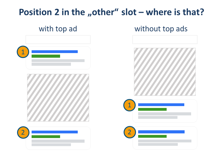
In general, only five ad positions can be reliably located: the four top and the first bottom ad positions. All other bottom ad positions are ambiguous because we never know how many ad spaces were occupied in the top block.
A Conventional Analysis
The collected data points could now be used for an analysis of position performance. However, if we evaluate the click-through rates of the top positions then it becomes clear that something cannot be right here:
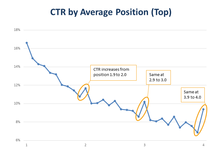
Especially when going to full numbers, a worse average placement leads to better click-through rates. This indicates that the average position data is misleading. Normally we would still have to be content with that if there wasn’t another little trick.
Going from Average to Exact
The basic idea is incredibly simple: with a case number of one, the average becomes an exact figure. Let me illustrate this with two statistics:
- 25 employees eat an average of one ice cream per person.
- Martin eats an average of three ice creams per person.
In the first case we only have an average for the individual employee. In the second case we immediately know why the first floor freezer is always empty.
The same principle can also be applied to ad impressions. So if we look at a single ad impression, an average position of 3.0, for example, tells us exactly where that impression took place.
For our data collection this means that we only keep those data points where we had exactly one impression (at position 1.0 we can be a bit more generous).
This of course reduces the amount of usable data by several magnitudes. This is why the whole analysis only works if you have access to a big enough amount of data. In our case, this came down to more than 40 million impressions about exact positions – enough to work with.
CTR by Exact Position
For starters, we looked at CTR by ad position (based on data from 2018):
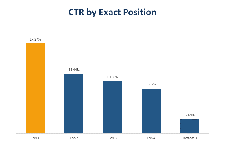
This clearly shows that the first top position has a much higher click rate than all the others. The differences between the other top positions are much smaller.
This corresponds quite well to the new division into “absolute top” and “top” positions, suggesting that this indeed the right distinction to make. Looking at the subtleties of the average position metrics on the other hand seems even less helpful in light of these results. Even if it was reliable, it makes little difference whether an ad was in position 2 or 3, for example.
The important distinction seems to be exactly what Google is providing through their old and new impression share metrics:
- Whether the ad was at the absolute top position,
- somewhere else on top,
- at the bottom,
- or nowhere at all.
Even though it may feel wrong – replacing a seemingly precise metric with the more general impression share metrics is probably a good thing for advertisers.
Data Quality
Even though our data is extensive and we’ve put considerable effort into collecting it, the details of our results are probably not representative of the average Google Ads advertiser. The data comes from accounts managed by Bloofusion, which means
- there’s a certain standard of how we do things
- some industries are better represented than overs, especially ecommerce
- the same goes for some countries, especially Germany
For these reasons, the figures here should not be considered as an absolute and precise truth. However, we can use them to understand the bigger picture.
What’s Next?
In the coming weeks I will present more insights we’ve gathered from the data. If you have concrete questions we should look into, please write them in the comments.
The second part will be about the differences between devices – what is it with mobile and the absolute top position?

Martin Roettgerding is the head of SEM at SEO/SEM agency Bloofusion Germany. You can find him on LinkedIn.